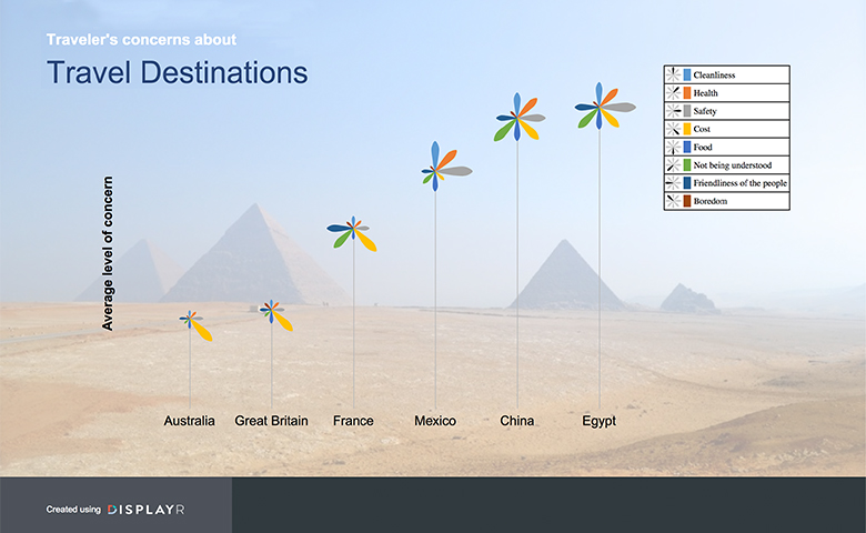

This is the first in a series of posts designed as a DIY training course for using Displayr. This case study shows you how to create a simple dashboard using a very cool visualization. You can jump ahead and see the completed version of the dashboard here (in view mode). You can view a video of this dashboard being created here.
Step 1: Create the document
To create a document, sign in to Displayr and press the + Add New button on the documents page, and give the document a name that you like (e.g., Traveler Concerns).
Step 2: Create a visualization
- Open up this spreadsheet, select the data and copy it (e.g., press Ctrl-C)
- In Displayr, click the Insert tab in the Ribbon.
- Click Visualization (Analysis) > Palm Trees.
- Press Paste or type data... in the Data source section of the Object Inspector.
- Place your cursor in cell A1 and paste in the data table (Ctrl-V).
- Press OK.
- Check the Automatic option at the top of the Object Inspector.
You should now have a palm trees visualization. Please read Using Palm Trees to Visualize Performance Across Multiple Dimensions (Egypt's Scary Palm Tree) to learn more about this visualization.
Step 3: Customize the visualization
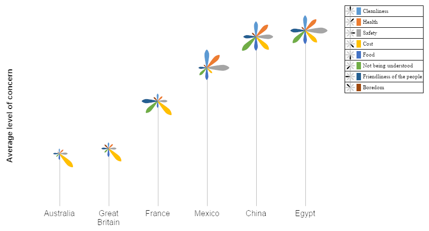
- The current visualization creates a "tree" for each attribute. We want to flip the data around to create a separate one for each country: In the Object Inspector, select Inputs > DATA MANIPULATION > Switch rows and columns.
- Click on the Chart tab of the Object Inspector and make the following changes:
- CATEGORIES (X) AXIS
- Axis title font size: 16
- VALUES (Y) AXIS
- Axis title: Average level of concern
- Set Show axis to false (i.e., un-check it)
- Axis title font size: 16
- CATEGORIES (X) AXIS
- Your visualization should now look like the image below.

Step 4: Format the background
- Insert the background image (save this image first): Insert > Image (Text and Images) and resize it to fit the page.
- This image is a bit too bright to be a good background, so I will employ the standard trick of graphic artists and place a semi-transparent image on top of it:
- Insert > Shapes > Rectangle and resize it to cover the page.
- In the Object Inspector, set the Line Width to 0
- Click on Fill Color > More Colors and click on the White option (top-right) and set the A for alpha level to 60 and press OK. (The alpha level is the complement of the degree of transparency - more alpha equals less transparency.)
- Now we need to send the background image and the transparency to the back. First, click Appearance > Send to Back (Arrange), and then click on the pyramids and press Appearance > Send to Back (Arrange) again. (As is discussed in Case Study: Visualizations, we can do this more efficiently using the Page Master.)
- Resize the visualization so that it appears neatly on the page.
Step 5: Add a title
- Click Insert > Text Box and click your left mouse button where you would like a title to start.
- Type Traveler's concerns about, press your ENTER key on your keyboard and type Travel Destinations.
- Select the top words in the title and set them to bold, 16 point white (using Appearance > Font in the ribbon).
- Set the bottom of the heading to 28 point font size and the color to dark blue.
Step 6: Exporting as a Web Page
Displayr is used in two different modes. Everything we have done so far is in edit mode, which is the mode that is used when creating documents. Once a document has been created, it is shared in view mode. To export it so that it can be viewed by other users:
- Click the Export tab in the Ribbon.
- Press on the very bottom of the Web Page (Document) button, and check the option which says Hide navigation bar. (You will understand what this is after doing the next of these blog posts).
- Click on Export.
- Then Snapshot and View.
- Press A link that can be used by anyone.
- Then Open in a new tab.
- You now have a dashboard! Now you can copy the URL and send that to whoever you wish to see your dashboard.
Check out our wiki for more information on exporting, password access, and the different modes.
Try it yourself
Click here to sign into Displayr and edit the document that I created when writing this post.
To learn a bit more about Displayr, please read Case Study: Analyzing Survey Data, which introduces you to the creation of charts, tables, filters, and reports, from raw data files.


